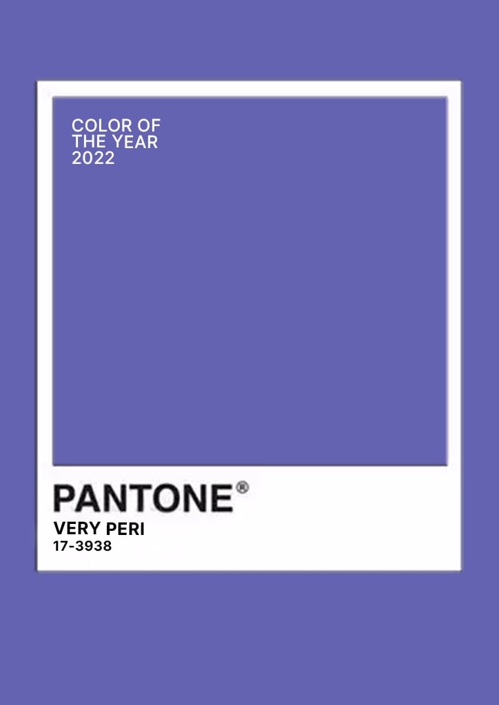
Can you believe we are already in 2022? A new year means that Pantone, Inc. has to decide on another color of the year. This year, they decided to go with the unique color of, “Very Peri” a transitional blue and purple color.
COLOR SWATCH BREAKDOWN FOR 2022 PANTONE COLOR OF THE YEAR
PMS: PANTONE 17-3938 Very Peri
RGB: 104, 104, 171
CMYK: 67, 64, 3, 0
HEX: 6868ab

Very Peri is described as a courageous color that brings creativity and confidence to the forefront. It opens up possibilities in this transformative period of time we are in. The hints of blue in the color helps it compliment other colors that surround it. At Eastwood Homes, we love the symbolism and meaning behind colors! They evoke complex emotions, and thoughts!
Leatrice Eiseman, Executive Director of The Pantone Color Institute says, “As we move into a world of unprecedented change, the selection of PANTONE 17-3938 Very Peri bring a novel perspective and vision to the trusted and beloved blue color family, encompassing the qualities of the blues, yet at the same with its violet red undertone, PANTONE 17-3938 Very Peri displays a spritely, joyous attitude and dynamic presence that encourages courageous creativity and imaginative expressions.”
Pops of color throughout the home is dominating the interior design space. As we move away from all neutrals, Very Peri would be a great option for breathing colorful life into your home! Here are a few ideas of how you can use Pantone, Inc. 2022 color of the year throughout your house!
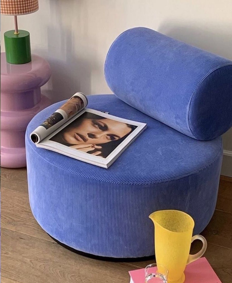
Furniture! Yes, we mean it. Accent chairs are supposed to bring dimension to a room, and what better way to do that then with the bold Very Peri color. Whether you have neutrals throughout or you already have color incorporated in your design, Very Peri with its hints of blue, will compliment most colors!

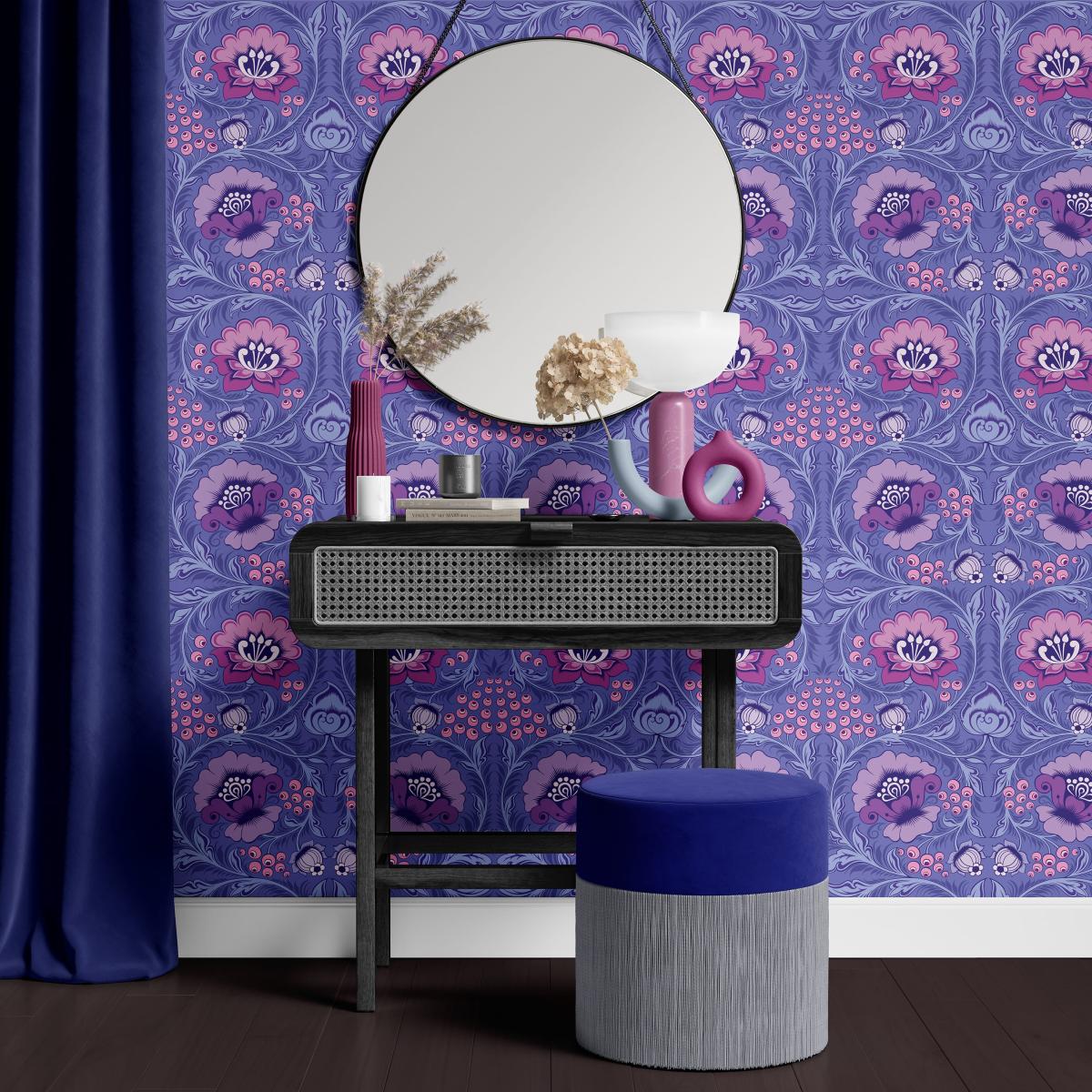
Another great idea for PANTONE’s 2022 color of the year would be to incorporate it in wallpaper. Whether you’re looking to give your half bath a face lift or wanting to spice up your dining room accent wall. Very Peri can compliment any room!
Looking for something more subtle? You can always incorporate this gorgeous color in small accents throughout the home like table runners, throw pillows, glassware, etc. The options are limitless when it comes to interior design. Very Peri is meant to bring out creativeness so get out there and make your space your own!

We’ve all heard the old adage “The heart of the home is the kitchen.” It’s certainly true! It’s where we gather during holidays, birthdays, and get togethers. It’s where the kids do homework. It’s where we try that new recipe from Pinterest. It’s where we wander for the midnight snack. It’s also one of the biggest pain points we hear from homebuyers ready to upgrade their homes and their lives. Whether it’s a disjointed kitchen design or not enough storage, many older kitchens are not built effectively. Nothing is more painful than a kitchen that simply doesn’t work well. It makes sense then that this is one of the most important rooms for our homebuyers to get right when choosing their new floorplan!
.png)
We are so proud to build gorgeous new single-family homes and townhomes in the Raleigh metro area because it is such a unique and popular place to live! Raleigh is also one of the South’s best-kept secrets. If you aren’t from around here, you may not know what makes “The Triangle” such a great place to live. And that is why we are featuring the Raleigh/Durham/Chapel Hill Triangle in our new blog series highlighting all the great areas where we build!

Many options in our kitchen are primarily aesthetic in nature, but our countertop choices can affect the way we work in this space. There are pros and cons to each different countertop surface option. If you are considering changing out your countertops, it really is a decision that is worth researching because this surface must stand up to your lifestyle and needs.